Graphics in Reports & Publications
Most people who read to obtain information prefer to have the text supplemented with visuals. The advantages of 2D and 3D data visualization are numerous. Aside from effectively summarizing and supporting in-text data, the human brain is far more efficient at internalizing visual content than the written word, making graphic use an effective strategy for relaying data quickly in reports.
But graphics in reports and publications have a dark side, too. Consider a few perils of poorly executed graphics:
• Providing misleading or contradictory information
• Failing to provide any useful information at all
• Detracting from your message or credibility
With these drawbacks in mind, here are six tips for more effective use of graphics in reports and publications:
1. Use Graphics to Support the Text
Simply repeating in-text information in graphical form is pointless; the text and the graphics should supplement each other and help readers form new connections through visual representation. Use the graphic as a jumping-off point for discussion—for example, using EE’s 3D hydrodynamic model of hypothetical oil spills to help readers visualize the far reaching impacts of environmental disaster.
2. Place Graphics Carefully
As much fun as it is to showcase data sets in colorful and eye-catching 3D topographical models, graphics shouldn’t be included for their own sake. And if graphics are included, make sure that they’re located near the text they’re supporting. Making readers hunt for the image being referenced in the text is frustrating and defeats its purpose. Some data sets require text and image to be placed in close proximity to help users fully understand the data being displayed.
3. Use Color Carefully
If colors are used, each color should be meaningful and distinguish each data set when more than one is present. Although having too many colors in the one graphic can overwhelm viewers, some graphs (such as EFDC’s water quality analysis visualizations) rely on a spectrum of colors to model data. The blue and red colors in these graphs represent the minimum and maximum dissolved oxygen in the water column. It’s advisable to use color ramps that are easy to interpret and help users understand the story being told by the graphs. Unless the data requires color, consider other tricks like hatching, line styles, contouring, and texturing.
4. Don’t Overuse 3D Models
Many designers will use “3D” shapes and data models because they look impressive, but using 3D models for data that can be represented in 2D is unnecessary and distracting. EFDC’s water surface profile of sediment erosion, for example, contains three variables (elevation, total PCBs, and distance) that can all be easily understood with a straightforward 2D graph. When in doubt, aim for simplicity in the graphics you use. 3D graphics have their place in presentations where 2D and 1D examples will not do justice to the information.
5. Use Graphics Honestly
Graphics used should have a sense of scale consistent with its data. Consider a water sediment erosion data set containing a range of elevation values from 4 meters to 12 meters. If the Y-axis base of the chart begins at zero meters and caps at 50 meters, data contained within this 4-12 range would appear to have little variance. But if the base of the chart begins at zero meters with a cap of 12 meters, the range displayed offers a more honest view of data relationships. Don’t jeopardize your credibility with misleading graphics.
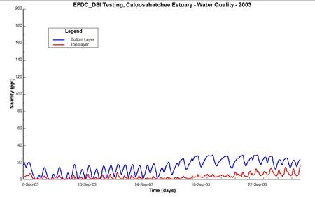
Let’s look at an example of two water quality charts showing the salinity for the top layer and bottom layer of the water in Florida’s Caloosahatchee Estuary.
Graphic A gives an unrealistic scale that makes the information also look more flat-lined than in reality. The ranges displayed offer a poor representation of the data. With these inappropriate scales, conclusions about the data can’t be effectively drawn.
In graphic B, the salinity across the Y axis is reasonable and more effectively shows the change and dynamics in the salinity ebbs and flows. This provides a clearer picture of the story the data is telling us.
6. See What It Looks Like in “Real Life”
Even the best graphic can become an indecipherable mess when scaled down to the size it will be when printed. Be sure to test each graphic at “actual size” to ensure it still makes its point.
Numerous resources are available that go into greater detail on using graphics effectively in reports. Figure out what you’re trying to say and then determine which style of graphic will best support your message. For more information on creating value-driving data visualizations for reports and research, contact DSI today.


