Communicating your modeling results is as important as developing a good model. An animation of the processes you’ve modeled is one of the most compelling ways you can help your audience understand your results. EEMS has powerful animation capabilities that have proven highly effective in client presentations, videos, and marketing materials.
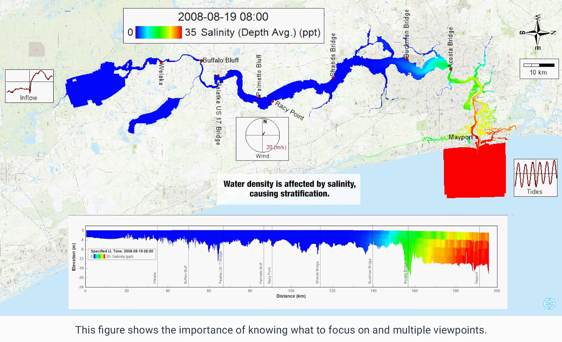
This figure shows the importance of knowing what to focus and multiple viewpoints.
How to generate an animation using the EEMS interface is described in detail in the EEMS User Guide, but creating a successful animation is much more than just a step-by-step click and drag process. It requires understanding the audience, planning, and testing. In this post, we present some key aspects of animation development using EEMS.
- Know your audience. Will you be presenting your animation in a technical conference? A client meeting? A stakeholder meeting? A venue where you are not even sure about the quality of the computer available to present your work? How you design and present your animation will be different in each situation.
-
Not sure about computer quality. Unfortunately, it is not uncommon to arrive at a meeting to find the only computer available is not capable of running your animation, so the safe bet is to have four or five different still images on hand to show temporal change in the parameters of interest (e.g., ice-cover, eutrophication, oil spill, flood extent), in case you cannot show your animation after all. Based on our experience, even if you are sure about the computer, it is safest to have these emergency images on hand, just in case.
-
**Technical Presentation.**This assumes that you are in a conference, where many people understand most or all of your technical terms. But it also means that you may have only 15 minutes for your presentation, and you may have only a couple of minutes to show and talk about your animation. People may be sitting far from the screen in a large auditorium, so they may not be able to see subtle color differences, read small fonts, or have enough time to scan through the entire display. Client Meeting. Client meetings are typically in smaller rooms, with less restriction on time. Clients tend to want to know all the details (because they have paid for the modeling study), and they generally try to make an extra effort to understand the presentation. Some clients, however, may not be familiar with the technical terms you routinely use.
-
Stakeholder Meetings. In general, your information must be simplified considerably for a more general audience like a stakeholder meeting, because your audience may have only a limited understanding of the technical terms involved. Animations tend to be more interesting and easier to understand than long, technical explanations, so a good, simple animation can capture the audience’s attention in a stakeholder meeting.
-
What is the focus? In a typical modeling study, multiple physical processes are simulated, and the model end point (eutrophication, flooding, oil spill, sediment erosion, etc.) is a function of these processes. It is important to recognize, though, that not all these processes may be useful or of interest to the audience. You may also lose your audience quickly if you pack in unnecessary information, so think about what is most important to this audience and focus on those processes.
-
If it does not add value, then remove it. It may sound simple to say, but this advice is difficult to implement. The more we love our own creation, the more difficult it becomes to find items to remove. Here are some guidelines.
-
Simple Legends. Use fewer words and extra-large font in the legend; it is best to keep only three or fewer items.
-
Precision and time. Are the values you present conveying false precision in the model output? You may need to reduce the number of significant digits. Do you need to show change in the animation in days, hours, and minutes? Is the year important for animation purposes (especially for a scenario analysis)?
-
Ticks in graphs.Graphs are often part of an animation. Simplify your graphs by removing the extra ticks and gridlines unless they are truly important for understanding the data. Sometimes, only two ticks or no ticks at all on the axis are enough to convey the information.
-
Animation Background. Depending upon your audience or the physical process you are demonstrating, a background with images can either be useful or distracting. For instance, when demonstrating the extent of flooding, it may be helpful to show real-world features getting submerged, but when you want to focus on a particular process in a waterbody, details of surrounding features may be distracting.
- Know your colors. Colors can be tricky. With seemingly unlimited options to choose from, we suggest the following key points to keep in mind before heading straight into selecting one of the color ramps (colormaps) provided in EE.
-
Know your data.Knowing the data properties you want to present is essential; this includes the type of data (e.g., topography, temperature, salinity, etc.) and data boundaries.
-
Relate with general experiences. We all share some instinct when interpreting colors. Blue feels cold, and red feels hot. Darker colors look heavy, while brighter colors look light. Stick with these general instincts to help the audience read the data more easily. Similarly, people bring their life experience when interpreting the colors of specific properties. We all tend to think of plants as green and soil as brown, so choose a green color ramp for Chl-A concentration, and a brown color ramp for turbidity, total suspended sediment concentration, and related features. Your audience will find it easier to understand and identify with the colors.
-
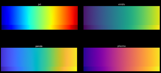
Convey data correctly. The use of a color ramp is helpful for visualizing data, but some color ramps like jet or rainbow can create false breakpoints and bands, even though the data change gradually. Since most modeled properties in the natural environment vary gradually, a color ramp that changes linearly in brightness can convey your point more clearly and accurately.

-
Further details. Consider choosing a color ramp that is accessible to those who have color-deficiency challenges, if possible. The most common type of color deficiency challenge in the population is red-green blindness. Thus, selecting a palette that transitions between blue and yellow (avoiding the red and green ends of the spectrum) can make the presentation more accessible. Another approach would be to use a color ramp that focuses on changes in the lightness/darkness of the color. This style ensures the result is still discernable when printed out in monochrome.
-
Suggested readings. If you would like to learn more about the effect of color palletes in data visualization, here are a few suggested readings that may be of interest.
-
Why Should Engineers and Scientists be Worried About Colors?: This article provides a detailed explanation of colormaps and shows how the most commonly used colormap (rainbow/jet) can be troublesome in various ways.
-
The Rainbow is Dead… Long Live the Rainbow!: This series of blog posts offers more details about the rainbow colormap and other suggested colormaps, with comparisons. It also provides lots of external sources related to this topic.
-
Picking a Colour Scale for Scientific Graphics: This short blog post offers some quick and beautiful colormap examples for several types of data, so it is good for a quick reference.
-
Beautiful Colormaps for Oceanography: cmocean: This web page introduces the set of colormaps cmocean in matplotlib, while also providing actual data usage examples and other external related article links.
-
A Better Default Colormap for matplotlib: This is a conference talk introducing the newly developed set of default colormaps in matplolib, including identifying improvements and presenting the reasons for this change.
-
Multiple Viewpoints. It may be easier for your audience to understand a process if you present it from more than one point of view. For instance, presenting both a plan view and a time-synced elevation view can describe the story more effectively than one view alone. The depiction of changes in water quality over time is one of the most common animations that benefits from showing both plan and elevation views.
-
Sample Animations. Here are two sample animations that implement some of the suggestions above to convey information to the audience effectively.
Water Quality Simulation Study: The Chl-A longitudinal profile in this water quality demonstration video is a good example of the right color ramp choice. It has a good upper and lower boundary set, linear lightness change in green makes a direct link with general experience and conveys the data correctly. However, the dissolved oxygen and temperature color ramp might not be the best choice, as reasons mentioned above.
Movement of a Ship in a Canal: This propwash demonstration video is another good animation example. It includes only necessary information, adequate range, linear color ramp, and multiple viewpoints.
While it may not always be possible or necessary to follow all of the points mentioned above, we still encourage users to explore all these possibilities in generating animations. We encourage you to practice animation generation in EEMS using the demo version of EE and sample test cases.
For more EE animations, you can always look for the demonstration videos on our YouTube page. If you would like to show your work and share your thoughts, do not hesitate to email us or join our forum.
By keeping in mind the suggestions in this blog post, you’ll be able to use the EEMS animation features to their fullest capacity, and your audience will be able to thoroughly appreciate your model results.


